Thursday, May 27, 2010

those boys of summer....


-Well, I got horny and you weren`t around...-

That`s basically the whole description for this pic, lol.
I haven`t used render texure in a while, mainly cuz it sometimes doesn´t match the picture, but I liked how the ground ended up.

Hope you guys like it

Friday, May 14, 2010

Sea Food!


And, finished...
For the final touches, I added reflections and highlights to define the body. The overall picture ended up looking brighter than I expected, hmmm....-_-
Dunno if it`s too saturated but at least the high contrast is acheived, wich was my main goal.

I liked the way the waves ended up. The tail looks a bit skinny for this guy´s frame, but I liked the texture of it


So, there you go.
The process I go thru to create a piece.
Of course, I go back a bunch of times to fix all kinds of parts, maybe with more practice I´ll learn to work at a faster pace

Anyway, hope you like it

Wednesday, May 12, 2010

and now, some shade...

I found that large patches of light define the shapes better than a bunch of small patches here and there....
It`s also SUPPOSSED to make the rendering easier, but I always have troubles deciding wich parts to shade ( I wanted to shade that tricep so bad but it lookd awful)

I decided to add a single strong light source, it hits his back and butt.
I`m starting to render water, sand and scales. The tail´s fins look a bit odd, I guess I`ll change it again later. The skin-fish tail division is also bugging me, but it will be on of the last parts I work on, so bear with it for a while

Anyway, is slowly coming together. Some reflective light and speculars should do the trick


Yay, halfway there!
Good thing about dark layouts: I barely need to do shading
Bad Thing about dark layouts: I will spend double the time adding reflections...XP
You`ll see what I mean next time...

Tuesday, May 11, 2010

moving on to coloring


Here I layed down the basic scheme.
As I said in the last post, the pic is already too cheescake to add a sunset color hue, so I went for a night setting instead, I also think it looks sexier, what do you think?:P

So, the palette is very limited, bunch of blues and pale purples, then just a dip of yellow for skin and highlights.
Here`s the basic idea. I chose bakground colors in harmony with this guy`s color palette.
I like it, but is sorta flat


So, I went ahead and greyed most of the colors out. I know I lost a lot of details in the background, but look how deep and rich his skin looks (Yumm...)


Now, the color match is more or less achieved. I may change some of the colors ahead, but won`t be as drastic.

Next time, I`ll start sketching shadows and basic lights, hope to see you then

Saturday, May 8, 2010

The process of creating a piece 1...


...or why is it that I`m so damn slow at this, lol.

Lately, I recived a few mails asking to see what is the process I follow to make a picture.
Although I don`t really have any secret techinque or anything I`d be glad to share this process, if anyone is interested.

So, here`s how it goes...


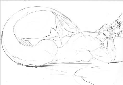
I`ve had this pic for quite a while, and now I`ve finally have the time to color it, yay!! Please forgive the sloppy pencil work, it`ll be less noticeable once the color starts kicking in

I saw this pose on another artist`s website, hope he/she doesn`t mind. Of course, I changed the angle, position and overall placement, I wanted this kid to have a " come hither" look while showing off that booty heh heh

The composition is sorta cheesy, but I`ll try and make it more intersting with some strong contrast, (or at least I`ll try)

Stay tuned for next post, when I`ll lay down the basic color scheme

see ya then